A PowerPoint diagram to visualize impact or priority levels, showing progression from low to high influence with clarity, flexible layouts, and bold visuals for professional presentations.
Get this diagram:
About This Diagram
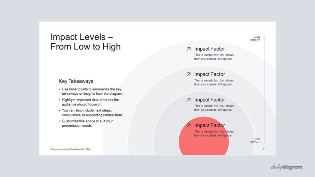
The impact levels diagram uses a series of concentric circles, from smallest to largest, to represent how the influence of a factor expands or intensifies.
This simple yet powerful visualization is useful for showing levels of impact, priority, or significance in strategy, planning, or risk assessment.
The layered design helps audiences quickly grasp the growing effect of an idea, project, or decision.
Fully editable in PowerPoint, it allows you to adjust colors, text, and layout to fit your message.
Key Features & Specs
Universal Features
- Fully Editable: Easily change text, colors, and layouts to match your needs.
- 16:9 Aspect Ratio: Optimized for modern screens and presentations.
- High-Quality Visuals: Professional, clear design that looks polished in any context.
- Structured Object Naming: All elements are neatly labeled in the Selection Pane for fast, intuitive editing.
- Multi-Purpose: Ideal for meetings, projects, strategy sessions, and personal organization.
- PowerPoint Ready: Works entirely within PowerPoint; no extra software needed.
- Google Slides Compatible: Most diagrams can be used in Google Slides by opening the .ppt file. Some advanced effects (like text transforms or animations) may not be fully supported.
Diagram-Specific Features:
- Compare levels of impact or importance at a glance in editable slides.
- Perfect for prioritization, analysis, or decision-making presentations.


